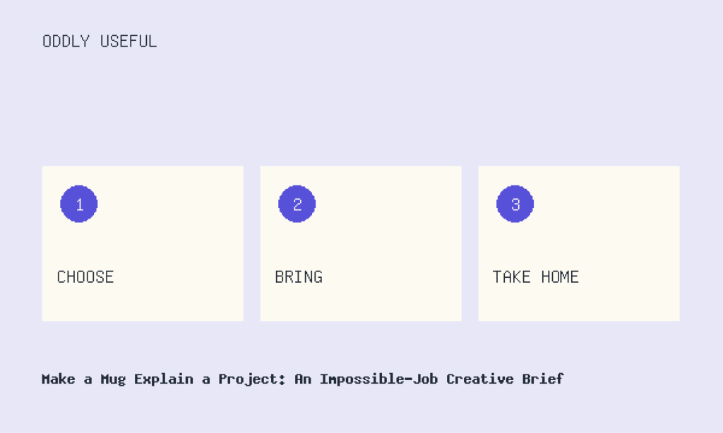
A plain ceramic mug sits beside a laptop. Its impossible assignment: explain a complicated neighborhood supper project before the coffee gets cold. It cannot speak, light up, or grow a tiny presentation screen. It has only its shape, two printed colors, and whatever fits on its surface. That absurd limitation creates a useful hypothetical creative brief.
Give the object an unreasonable assignment
Here is the invented project the mug must explain: Maple Street Table, a monthly potluck where neighbors choose one shared question, bring dishes connected to it, and leave with a one-page collection of recipes and observations.
The initial brief is deliberately loose: “Design a mug that explains Maple Street Table. Make it playful, welcoming, and memorable.” That sounds pleasant, but it dodges the important questions. Explain the project to whom? At what moment? Which part must survive if the reader gives the mug only ten seconds?
Let the first idea be delightfully wrong
The first concept turns the mug into a miniature neighborhood. Illustrated houses wrap around the base. Steam rising from the drink becomes “conversation clouds.” The handle is labeled FRONT DOOR, and a winding dotted path leads past tiny dishes to the words EVERY PLATE HAS A STORY. On the bottom, visible only when the mug is lifted, it says SEE YOU NEXT MONTH.
It is charming—and not very useful. A person could study every detail and still miss the operating idea. Do guests bring any dish or follow a theme? Is this a dinner, a storytelling club, or a recipe exchange? The design spends its limited surface on atmosphere and asks the slogan to carry information it does not contain.
Still, one piece deserves rescue: the winding path. A path can show that the project has stages. The problem is not the visual device; it is what the device currently connects. Houses and slogans create a scene. The project needs a sequence.
Write constraints that force an explanation
Now tighten the brief. The mug will be read by someone who has heard the name but does not know how the gathering works. It must communicate three actions in order. The main explanation must remain visible while the mug rests on a table, so nothing essential can go underneath. Printing is limited to dark blue and warm red. The design may use no more than eighteen words, excluding the project name. Decorative details are allowed only after the process is understandable.
There is also a content decision: the mug does not need to explain scheduling, dietary coordination, cleanup, or who prints the page. Those details belong elsewhere. Its job is narrower: give a newcomer a correct sketch of the event.
The revised brief becomes specific: “Using a continuous path and no more than eighteen words, show a newcomer the three-part rhythm of Maple Street Table: choose a question, bring a connected dish, collect the group’s recipes and notes. Keep every necessary step visible from the side.”
Turn the rescued element into the final concept
The more useful revision keeps the dotted path but removes the illustrated street. Near the handle, a blue question-mark card begins the route. Beside it: CHOOSE ONE QUESTION. The path moves to a red bowl labeled BRING A DISH THAT ANSWERS IT. It ends at a blue folded page with TAKE HOME THE RECIPES + NOTES. The project name sits above the sequence, not inside it.
The instructions use fourteen words plus a plus sign, comfortably within the eighteen-word limit; the project name is excluded.
The color change distinguishes the shared decision from the contribution, while the return to blue links the opening question to the closing record. The handle becomes a natural starting landmark without needing the FRONT DOOR joke.
Once the explanation works, a small remnant of playfulness can return: the dotted route passes behind the bowl and reappears as a curl of steam. The steam carries no essential meaning. It simply rewards the closer look.